Units of Measure
CSS recognizes several units of measurement for specifying lengths. They fall into one of two categories - absolute or relative.
Absolute units are intended for style sheets targeting print-based mediums. When you print out a web site, a separate style sheet for printing is sometimes applied to the page and sent to the printer.
Because they're often a low priority or not provided at all, browsers have developed pretty good methods for adapting web pages to print without any provided style sheet for printing.
Screen based mediums primarily use relative units. A relative unit is either an adjustment based on another number, or a unit that doesn't represent a physical distance.
Here are some valid units of measurement in CSS:
| Unit | Type | Rendering Intent | Definition |
in/cm/mm |
absolute | Inches, Centimeters, Millimeters. Browsers attempt to render the item at its real-life size on the monitor, but many variables make this difficult. Resolution in CSS is always assumed to be 96ppi, so this often becomes problematic (particularly on HiDPI screens and mobile browsers with scaling). | |
pt |
absolute | Points. Roughly equal to 1/72". Used mostly in print and print-oriented style sheets. Should not be used for web pages. | |
pc |
absolute | Picas. 1 pica = 12 points | |
px |
absolute* | screen | Pixels. *Technically a pixel is actually a relative unit (more on that below), but it is the most absolute unit of measurement we have for screen-based mediums. |
% |
relative | screen | Percent. Based on the element's container or whatever value the property would otherwise be inheriting. |
em |
relative | screen | Ems. Based on the box size of the letter M in a given font. Harkens back to old typographical printing methods with metal blocks for each letter, M being the largest. Almost exactly the same as using %. |
rem |
relative | screen | Rems. Similar to ems, but always based on the font size of the root element, instead of the parent element. (Illustration) |
vw/vh |
relative | screen | Viewfinder width and height. 1vw = 1% of the viewport's width. These units are relatively new and can be very useful. Browser support is good. |
vmin/vmax |
relative | screen | These viewports units represent percentages of whichever dimension on the viewport is either shorter, or longer. Check out resources at the bottom for more thorough explanation. |
Other less common units recognized by CSS include ex (ex-height), ch (zero-width), and more.
Misconceptions about The Pixel
The pixel, or picture element, is possibly the most misunderstood unit on computers. It causes confusion for people in a wide variety of ways, not just on the web. Most of this confusion stems from a long history of designers and image makers adjusting from a print based world to screen based mediums. With HiDPI and mobile, this confusion is only exaggerated now that screen resolutions can no longer be safely assumed.
Pixels are for Screens, not Building Houses
A "pixel" does not represent a standard length in physical space. Since pixels can be many different sizes, there is no consistent, reliable size in the real world that we can use to define measurements "in pixels".
Pixels are for talking about dimensions on screen based mediums. You can't go to the lumber yard and buy wood that's 15,552 pixels long, and you shouldn't describe the width of your web page using centimeters for the same reason.
This is where resolution comes in. By itself, a pixel doesn't tell us anything about physical size until we also know the resolution that converts pixels into a physical distance. Resolution is almost always measured in ppi (pixels per inch) or dpi (dots per inch).
Formally, dots per inch refers to printer resolution (drops of color), and ppi refers to pixels on a screen, but effectively they both mean the same thing. This distinction is good to know, but most of the time you can use the terms interchangeably.
DPI Doesn't Matter on The Web
72dpi became synonymous with web-ready images, but what really matters is the overall width and height of the image in pixels.
Since screens deal natively in pixels, there's no need to convert pixels to inches using dpi or ppi. If the image is never being rendered onto a physical medium (i.e. printed), the resolution value doesn't matter.
A 600px wide image will display exactly the same on a web page whether the resolution is set to 72dpi, 300dpi, or 3000dpi.
Although it has no affect on how the image is displayed, I still recommend saving web-ready images at 72dpi. If nothing else, it saves you the trouble of trying to explain all of this when someone points out that your images are the "wrong size".
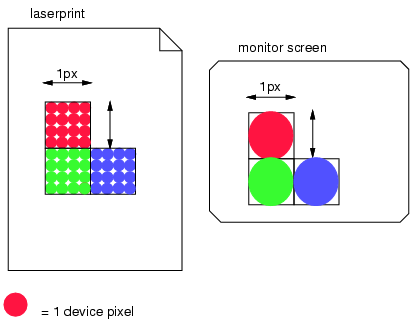
A Pixel is not A Pixel
A device pixel is one dot on a screen. That dot might be fairly big, in the case of traditional monitors, or it might be really small, in the case of retina displays. With the advent of HiDPI screens, pixels in the traditional sense can no longer be used as an absolute unit of measure on the web.
So if pixels have no reliable physical size, how is it that we can use pixels to specify exactly how big something should be on the screen? Well, we can't. But CSS, browsers, and operating systems get us pretty darn close.
There is a long lasting standard that computer monitors have had 96ppi - 96 pixels per one inch of physical, real-world distance. While this is no longer the case, even on non-HiDPI displays, it is a good reference point.
To try and solve this problem of what a pixel means on all browsers and devices, regardless of their resolution and size, the W3C uses 96ppi as the basis for a unit called the reference pixel, also called the CSS pixel.
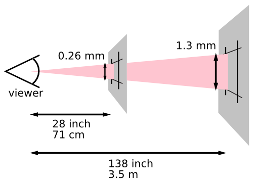
- CSS Reference Pixel
- The amount of your field of vision that a pixel occupies on a 96ppi screen at the average viewing distance of 28 inches.
That's a mouthful.
Basically, rather than being a consistent physical size, the part that stays consistent is how big the pixel appears to your eye (yes, very tiny). On desktop monitors this is roughly equivalent to 1/96 inches. On your phone it would be smaller, because you read with your phone closer to your eye. On a projector, typically viewed from far away, it would be bigger. One reference pixel is not necessarily one device pixel on a screen. It might be two, four or even more device pixels on a really high resolution screen.
The CSS reference pixel allows us to use px measurements in CSS and safely assume that things will be a certain expected size, regardless of what device our viewers are using. It gives us the closest possible descriptor to a consistent atomic size on the web.
To Summarize
- Inches, centimeters and other physical distances should be avoided in CSS (unless you're creating a style sheet for print).
- Pixels, ems, rems and percentages are best for screen based media.
- A true pixel doesn't have an inherent physical size. Resolution is also needed to map pixels to a distance in physical space.
- A reference pixel in CSS is a made up but standardized size that we can use for predictable, pseudo-absolute measurements. It is based on what we used to consider "normal", or 96ppi at an average viewing distance.
- Browsers and operating systems determine how many actual device pixels should be in one CSS reference pixel, so we don't have to worry about it.