Backgrounds and Sprites
Demo starter files
Backgrounds
CSS has a handful of properties for background colors, gradients, and images. You probably won't memorize all of these properties, so as with most things, refer to documentation as needed when working with CSS backgrounds.
Here are most of the properties and briefly what they do:
| Property | Usage | Default Value |
background-color |
Specify a background color using any of the normal CSS color input methods (named, hex, rgb, hsl, etc.) | transparent |
background-image |
Set a background image. Can be either a path to an image, or one of CSS gradient types. Multiple backgrounds are allowed, separated by a comma. | none |
background-position |
Position where the background is rendered. Can be specified in any of the accepted CSS units, but certain keywords are also allowed. | 0% 0% |
background-size |
Using any accepted CSS units. | auto |
background-repeat |
Set whether the background(s) tile. Tiling can be no-repeat, repeat-x, repeat-y, or repeat (both). |
repeat |
background-attachment |
Set whether the background(s) scrolls with the content or has fixed positioning. | scroll |
background-clip |
Set the context in which a background gets cropped - the inner content area, the padding box, or all the way out to the border edge. | border-box |
background-origin |
Set the context in which a background's position is determined - the inner content area, the padding box, or all the way out to the border edge. | padding-box |
background |
Shorthand method for setting all background properties at once (except background-origin). |
none |
CSS supports multiple layers of backgrounds on any given element, with some rules for how the layers are ordered:
- Each background layer can be an image, a gradient, or a solid color
- Layers are a comma-separated list of values for each property
- Images and gradients will layer top to bottom in the order they're listed
- Solid colors always render on the bottom, regardless of where you put them in the list
Hint: Since background colors always render on the bottom of the stack, if you want to layer a solid color on top of a background image, add it to the stack as a gradient.
Images
Background images can either be a url to an image asset:
element {
    background-image: url("path/to/img.png");
}
...or a CSS gradient. CSS supports linear, radial, and even multi-stop gradients.
element {
    background-image: linear-gradient(to bottom, #0F9D00, DarkSeaGreen);
}
The angle of a linear-gradient can be set using keywords like to right or to bottom. It also accepts angles in degrees deg, radians rad, gradians grad or turns turn. Reference links on these units are in the footer.
Because they leverage the browsers' native graphics engines and do not use any compression, CSS gradients are both smoother and more efficient to use than a png or jpg image of a gradient.
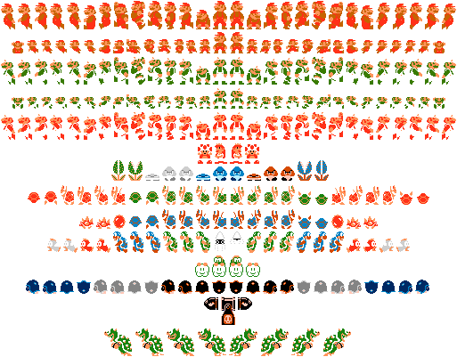
Sprites
The concept of sprites has been around for a very long time. An excellent example involves early video game systems. They didn't have enough computing power to handle lots of different graphics in memory at once. Instead, they used fewer, larger graphics and only displayed a small portion of them at a time.
We can leverage the same concept in CSS, by creating an element of a fixed size (a window, if you will), with a larger background image. Instead of loading separate images for different icons, we simply reposition the background to reveal a different part of it.
Benefits
There are a few benefits to this. Let's say you have an icon with a normal state, and you want to swap it out for something else on the :hover state. CSS background images aren't loaded until they're needed, so the first time you hover over one of these images, there's a pause while the alternate image is loaded by the browser.
More importantly that this, combining icons into fewer files reduces the number of requests your browser makes, speeding up your web site and reducing load on servers.
HTML:<div class="sprite sprite1"></div>CSS:.sprite { width: 40px; height: 40px; background-image: url("sprites.png"); background-repeat: no-repeat; } .sprite1 { /* positions are x then y, no comma */ background-position: 0 0; } .sprite1:hover { background-position: 0 -40px; }
Considerations
There are some important considerations when using background-replacement techniques in CSS.
- This is more suited for icons than something larger like a logo. A logo or brand is content, not styling, even though it is often an image. Therefore it should be part of the HTML markup as an
<img>tag, not a CSS background in a placeholder<div>. - CSS backgrounds do not always scale properly with web pages when zooming in.
- CSS backgrounds do not print!
Open up the starter files and let's play around with some of these background properties!