CSS Grid Basics
Demo starter files
It's not an overstatement to say that CSS Grid has completely changed the landscape of how we design on the web. In the next few lessons we'll look at what the CSS Grid Module can do, and how it is a tool built from the ground up to be responsive.
This very new feature in CSS landed simultaneously across nearly all of the major browsers in march 2017. It's one of the fastest and most synchronous rollouts of a new CSS feature ever, largely due to incredible popularity in the developer community. Web designers and developers flooded browser vendors with votes, feedback, and requests for the feature, helping to steer them toward making it a top priority.
What is Grid?
Like flexbox, Grid is a display mode that sets up a new formating context, and turns all of its direct children into grid items. The difference is that Grid allows layout in two dimensions - both columns and rows.
CSS Grid, as you can imagine, has a lot of properties that control its behavior. It even introduces a new unit, fr, and new functions like repeat() and minmax(). Luckily Grid is not nearly that complicated to get started with.
Setting up a Simple Grid
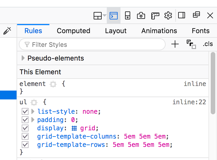
The first thing to do of course is to set display: grid on the parent element that is to become our grid container.
By itself this doesn't visually change anything until we tell the grid - at minimum - how many columns to make. We can define as many columns as we want, using any kind of CSS units. After that the grid algorithm handles the rest automatically, laying out each item across columns and rows.
- 1
- 2
- 3
- 4
- 5
- 6
- 7
- 8
- 9
Grid Gap
While you'll certainly still need margins and padding, you can easily add spacing between all the grid items using grid-gap.
- 1
- 2
- 3
- 4
- 5
- 6
- 7
- 8
- 9
grid-gap creates spacing between the grid items.The fr Unit
It's great that we can mix and match units when defining a template for our grid, but ensuring our width settings add perfectly to 100% quickly becomes a lot of math. To solve this we have a new unit of measure - the fr unit.
fr stands for fraction, and it basically means "whatever space is left". This allows us to use whatever width settings we want for the columns, and let the computer do the work of figuring out how much space is left. It even takes the grid-gap into account.
- 5em
- 1fr
- 64px
- 5em
- 1fr
- 64px
- 5em
- 1fr
- 64px
fr helps take care of the math when defining grid templates.It also works a lot like flex-grow and flex-shrink ratios. You should always use integers when defining fr units.
- 1fr
- 2fr
- 3fr
- 1fr
- 2fr
- 3fr
- 1fr
- 2fr
- 3fr
fr can be used to create a ratio of sizes.Inspecting the Grid
"Cool, but there's a lot happening here... how can I see what the heck is going on?"
Firefox has an excellent grid inspector in its developer tools. Chrome and the other vendors are working on their own, but the Firefox tools are the most complete.
Open the inspector in the developer tools and select the element for any of the parent grid containers on this page. You'll see a crosshatch icon in the display: grid property, which will turn on an overlay that shows the grid.
Switch from the "rules" tab over to the "layout" tab, and you can turn on checkboxes for other grid display settings like line numbers.
grid setting.Let's switch over to the demo files and set up a tiny grid.