Wireframes
Wireframing is the practice of drafting a layout before building a fully functional web site.
In the earliest stages, this is often done on good old fashioned paper for rapid sketching and prototyping, or white boards when collaborating in a team.
The next step is often creating the layout using vectors, in a program like Illustrator. Photoshop is also commonly used, though I have no idea why. (Probably because a lot of people are comfortable with Photoshop, even if it's not ideal for this kind of work.)
There are a handful of programs designed specifically for this task. Some of these programs even allow designers to test interactivity like button hovers and animations. If you're familiar with any of these applications feel free to use them. Otherwise, just use Illustrator.
Most of the time wireframing is done in grayscale. This allows designers to better see how objects interact with one another on the page, what takes precedence, where your eye is drawn, etc. Precision is also really important here, so you'll want to use Illustrator's tool palettes for sizing and positioning elements. Get familiar with guides, typing coordinates, and the alignment tools!
Though there isn't really a strict industry standard for how to make one, a wireframe should be detailed enough that it can be translated directly into a web page. This often requires additional annotations and notes. Always put those on a separate layer.
The rest of this page includes general tips for working with web designs in Illustrator.
Document Setup

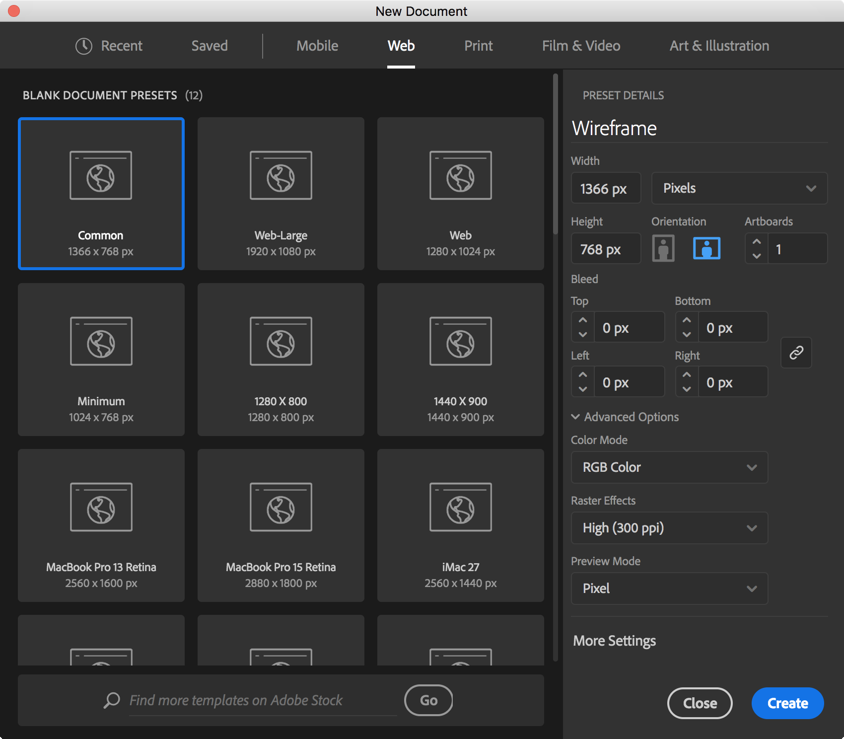
- Width can either be a common screen width, or the width of your web site.
- Height should be tall enough to show the header, sidebars, and the footer of the page. The screenshot above may or may not be a little short, but you can always change the artboard size later.
- Units: Pixels, since we're designing for screens.
- Color Mode: RGB, since we're designing for screens.
- Raster Effects: 300dpi. Gradients and effects will look better, and most computers are fast enough to handle 300dpi of pretty.
- Preview Mode: Pixel. Again, since our output medium is primarily screen not print, this will emphasize half-pixel imperfections and alignment issues when rendering shapes on the screen.
Transform Palette

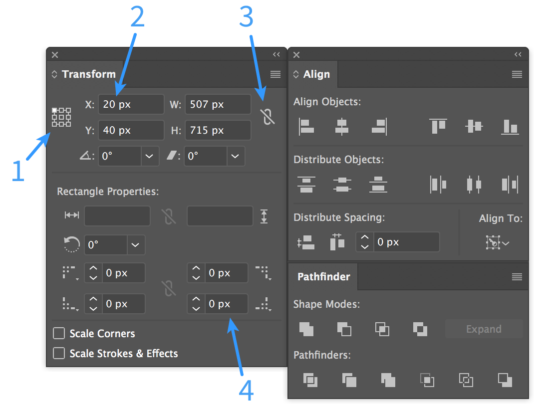
- Reference Point - on the selected object, this is the point of origin for the X and Y values. Changing the width and height will happen relative to this part of the object too.
- You can use
shift + up/down arrowto increment by 10 at a time. Also supports basic arithmetic. Try it!20 px +70 - Link or unlink proportional width and height changes.
- Easily add a border radius to rectangles.
Keyboard Shortcuts
Views, etc.
| Shortcut | Command |
cmd + r |
show/hide the rulers |
cmd + ' |
show/hide the grid |
cmd + ; |
show/hide guides |
cmd + opt + ; |
lock/unlock guides |
cmd + y |
toggle outline mode |
cmd + 1 |
zoom to 100% ("actual size") |
cmd + 0 |
zoom to fit artboard |
cmd + opt + 0 |
zoom to fit all artboards |
spacebar |
hold the spacebar at any time to temporarily switch to the hand tool for panning |
Tools, Objects, etc.
| Shortcut | Command |
v |
selection tool |
a |
direct selection tool (edit vector points) |
m |
rectangle tool - double click to type a specific size |
t |
text tool - click once and type for titles, click and drag for body text |
cmd + 2 |
lock selected object |
cmd + 3 |
hide selected object |
shift + o ("oh") |
artboard tool, for moving and resizing artboards |
cmd |
hold the command key at any time to temporarily switch to selection tool |
cmd + fcmd + b |
paste clipboard contents in front of or behind selected object |
cmd + opt + shift + v |
paste in place on all artboards |
click + opt + drag |
drag and place a copy of selected object |
click + shift + drag |
move selected object along axes |
General Tips
- Don't forget you can also use the grid to help with aligning objects!
- The Symbols palette can be very useful for elements that appear on multiple artboards, or multiple places on the page.
- Creating graphic styles for buttons and other repeated elements allows them to scale easier.
- Use "place" for other Illustrator documents, to create linked source files that can be updated in one place.
- You can simulate floating elements by selecting the placeholder and choosing Object > Text Wrap > Make.
- Change the color mode in the color palette to grayscale. This won't affect the document's color settings, it just makes it easier to select shades of gray.
- Need a grid or columns? Draw a rectangle outline and choose Object > Path > Split Into Grid.
- Change a font in all objects in one step: Type > Find Font.... Better yet, create a paragraph style!